
Table of Contents
Everything is data. Every entity, living, non-living, and artificial, possesses some data. For example, you, dear reader, can have a gigabyte-sized data file filled with your data. The details of your academic & professional career, your personal & financial credentials, browser history, bookmarks & passwords – there are many different kinds of data and much information. Now, think of the number of human beings on this planet. Think of all the different tangible & abstract entities in existence —governments, businesses, institutions, animals, cars, computers, tools, applications, etc. Everything possesses and can be represented using data.
Statistics, a branch of applied mathematics, provides us with the tools to process, understand, manipulate, and extract information from data. And frequency distributions are one of the most commonly used and effective tools among them all.
This lucid guide provides you with everything you need to know about frequency distributions and their tabulations.
Statistics applies mathematical laws, rules, operations, etc., to better sense data. Statistical distributions such as frequency distributions are, in essentiality, functions that operate upon data to uncover information, identify relationships, etc.
In any research, the next step after data collation is always cleaning up and organizing data. This is crucial if we are to carry out effective and in-depth analysis & uncover
Frequency distributions are functions that help to identify any pattern in a dataset. They do so by visualizing the frequency of occurrence of elements in the data set across observations and looking at their variability. Frequency distributions allow analysts to determine the number of times a value or an outcome appears across observations. They also showcase the range of values or the spread of an attribute.
Frequency distribution is vital in descriptive statistics and generally appears in tabular or graphical format. Let’s have a look.
A frequency distribution table is a common way to present the frequency of values/outcomes and their range across observations. Tables organize the observations of the attributes/parameters under study with columns presenting the values recorded.
A frequency distribution, thus, maps attribute values to their frequency of appearance across observations. They generally appear as tables or graphs. An accurate frequency distribution or graph requires complete information about the range of values research attributes take. The range is then divided into class intervals for clarity, organization, and easy visualization.
Thus, if we had to define frequency di7stributions, it can go something like this à
Frequency distributions are collections of observations obtained by segregating observations into classes and observing the frequency of occurrence of values/outcomes in every class.
There are different kinds of frequency distributions in descriptive statistics. Each kind has its nuances and applications. Developing each type is a bit different than the other. We will take a look at each of these types in detail below.
The five major types of frequency distributions are à
Each of these variants tells us all the different possible outcomes of attribute/s. They also show the number of times a single attribute or multiple attributes take a particular value, the range of their values, and the data interval in which attributes lie.
Let’s look at them one by one.
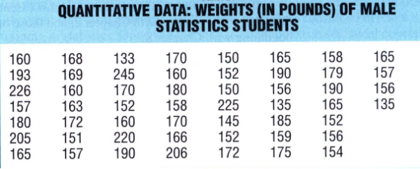
Consider the following table that lists readings of the weights of male students in a statistics course.

The table below shows a common way of classifying the above observations according to the frequency of occurrence.
Frequency Distribution Grouped Data
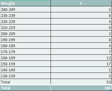
As evident, the entire range of values observed are grouped into classes. Each class or class interval comprises a group of values. This is called a grouped frequency distribution.
Observation data are grouped into 12 weight classes, each with an interval of 10. Every class interval can take up to 10 possible values. From the list of weights, we find that the lowest weight belongs to the lowest class while the highest value of weight belongs to the topmost class. The entire distance between the bottom and top classes is divided into multiple class intervals. The frequency column informs us how many times data from each class interval appears and shows us the total frequency of observations.
As can be seen, frequencies peak at 150-159. We also have a lower peak at 160-169. The frequency gradually decreases, but we find heavy concentrations in the 160s and 170s. If we plotted a frequency distribution graph, we would find that the distribution of weights is not balanced but tilted in the direction of the heavyweights.
Receive high-quality, original papers, free from AI-generated content.
Next, let’s look at the frequency distributions of ungrouped data.
Ungrouped frequency distributions present the frequencies of individual data elements instead of data classes. These distribution types come in handy when determining the number of times specific values appear in a dataset/s or observation/s.
One key thing to note is that ungrouped frequency distributions work best when the number of samples or observations is low. Things become a problem when there are hundreds of observations, most with unique values.
Here’s an example of an ungrouped frequency distribution—>
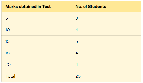
An ungrouped frequency distribution table will work fine because the number of unique values is low. Ungrouped frequency distributions are also called discrete frequency distributions.
Let’s now take a look at relative frequency distributions.
This is an important variation of a generic frequency distribution that shows the frequency of every class interval as a fraction/part/percentage of the total frequency of the entire distribution. The advantage of relative frequency distributions is that they show us the concentration of observations among different classes in a particular distribution.
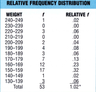
Above is a relative frequency distribution table developed from weight observations. The relative frequencies are obtained by finding the percentage of the ratios of frequencies of each class and the total frequency.
So, for the 160-169 class interval, we find the relative frequency as follows
(12/53) * 100 = 22.64 % or 23 %
This tells us that values within the 160-169 class interval comprise around 23% of all observations. Relative frequencies help compare two or more distributions based on the total number of observations.
You can easily convert a frequency distribution table into a relative frequency distribution table. Do so by dividing the frequency of each class by the total frequency of the whole distribution and then multiplying by 100. This gives you the percentage. If you want proportions, then skip the multiplication by 100. Proportions will vary between 0 and 10, while percentages will vary between 0 and 100. Relative frequency is the normalization of the absolute frequency by the total number of frequencies.
Let’s move on to the next type, cumulative frequency distributions.
Simply put, cumulative frequencies show the absolute frequencies of all values/ outcomes/groups at or below a certain level. Cumulative frequencies allow us to find out the relative standing of a group in a distribution. In most cases, cumulative frequencies are converted into percentages, also known as percentile ranks.
Here are the steps to crafting a cumulative frequency table.
Here’s the cumulative frequency table for our weight observations.
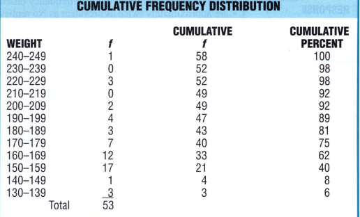
If relative comparisons among different classes are particularly important, then cumulative frequencies are converted to cumulative percentages. Cumulative percentages show the relative changes among classes, that is, how much one class interval differs from the other.
The above example shows a huge increase in cumulative frequency percentages at 150-159 and 160-169. Subsequent increases are relatively low. This indicates that values are concentrated at these class intervals.
Let’s move on to the final variant, the relative cumulative frequency distribution.
A relative cumulative frequency distribution sums the relative frequency of all values at and below a certain class interval. We can also define cumulative relative frequency as the percentage of times a value appears at or below a certain class interval.
Finding the relative cumulative frequency is nothing way too tough. All you need to do is find the cumulative frequencies of all class intervals and the relative cumulative frequencies by finding the percentage of individual cumulative frequencies concerning the total frequency.
Here are new data and their cumulative & relative cumulative frequencies.

All data is rounded off to the nearest value. As per the process, frequencies are added starting from the lowest class interval to obtain the cumulative frequencies. Relative and cumulative relative frequencies are determined by dividing the frequency of each class interval by the total frequency & then multiplying by 100.
If we had to interpret cumulative relative frequency, we could say that 53.3 % and 83.3 % of all values lie in the 91-103 and 103-115 class intervals.
And those were the five major variants of frequency distributions.
One key thing to note is that the nature of variables affects frequency distributions and their nature. Though the essence of both processes is the same, the format for developing discrete frequency distributions differs slightly from continuous frequency distributions.
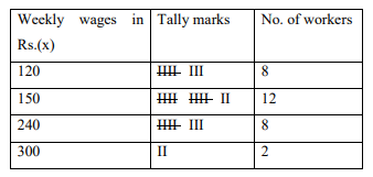
Discrete variables can take discrete values within the range of their variation. It is, thus, natural to come up with appropriate classes for accommodating all discrete values. Below is an example.
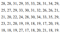
300, 240, 240, 150, 120, 240, 120, 120, 150, 150, 150, 240, 150, 150, 120, 300, 120, 150, 240, 150, 150, 120, 240, 150, 240, 150, 120, 120, 240, 150
The frequency distribution of all the given discrete values will be of the following form:
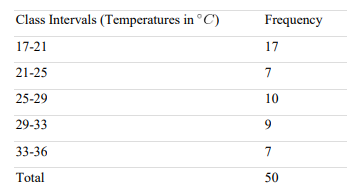
Below is data showcasing the daily maximum temperature in a city for 50 consecutive days.
As can be seen, the temperature variable takes discrete values. The data is non-categorical and ordinal. Hence, converting these discrete values into continuous values will be relatively easy. All we need to do is define appropriate class intervals.
To do that, we need to define:
If we take the number of classes to be 5, then an appropriate width for every class can be 4. We should be able to round off the product of class intervals and the number of classes to the entire data range.
The continuous frequency distribution will, thus, be as follows:
Let’s wrap up this write-up with a look at the key parameters/characteristics of frequency distributions.
Frequency distributions possess key parameters or characteristics central to descriptive statistics.
The three most important among them are:
Let’s take a quick look at each one of these parameters.
Measures of central tendency define how much the data tends towards the central position of the dataset. Naturally, they also help in finding the central position as well. These measures help in finding the center around which data is distributed.
Mean, mode and median are the three key measures of central tendency. Mean is the average value, mode denotes the middle value, and median is the value that appears the most.
Consider the following dataset à 1, 9, 2, 5, 55, 47, 3, 4, 7, 101
(1+9+2+5+55+47+3+4+7+101)/10 = 234/10=23.4
If we arrange the given dataset in an ascending manner, we will have the following:
1, 2, 3, 4, 5, 7, 9, 47, 55, 101
There are 10 elements, so the average of the two middle elements is the median.
So, the median is:
(5+7)/2 = 6
Dispersion or variability defines how spread or scattered the data in a distribution is. Measures of dispersion are range, interquartile range, standard deviation, and variance.
s2 = ΣNi=1 (Xi – m)2 / N
Where Xi are the data elements, N is the total number of data elements, m is the sample mean for sample variance, and the population mean for population variance,
s = ΣNi=1 (Xi – m)2 / N
Percentiles or Nth percentiles state the Nth percentage of values lesser or equal to a certain value. Intuitively., (100-N) the percentage of values are above that value. The formula is à
i = (N/100) * n
where N is the value of interest and n is the total number of values
Quartiles divide the entire dataset into four parts of more or less equal size. The dataset needs to be ordered from low to high to find quartiles. If we sort in an ascending manner and then divide the entire dataset into four near-about equal parts, we would find a:
The interquartile range is then calculated by subtracting the lower quartile from the upper quartile. This is the middle 50% range of all the data items.
Well, that’s all the space we have for today. Hope this was an interesting and informative read for one & all. Use this article for quick reference anytime you need help with frequency distribution tables.
However, if you wish to avail yourself of expert help, connect with us today. At MyAssignmenthelp.com, we have industry-leading academic writing and tutoring professionals to help you.
Call, mail, or drop a message at our live chat portal today.
Frequency distribution tables are tabulated representations that present or organize the frequency counts of the values or outcomes of a set of variables. When it comes sot organizing data, absolute, relative, and cumulative frequencies.
To create a frequency distribution table, you need to know:
Frequency distribution is one of the most powerful tools in descriptive statistics. It allows us to:
You can find the mean, variance, quartiles & percentiles, and standard deviation from a dataset.
Outliers and extremities lie at an abnormal distance from central positions and/or other data points in a distribution. If there are quite a few outliers in the dataset, then both central tendency and dispersion measures can be affected. Outliers affect the mean but not the median or mode. Outliers on the left side of a frequency distribution graph can bring down the mean, while those on the right can push up the mean.
A value must lie at least 3 standard deviations from the mean to be classified as an outlier.
Frequency distributions are employed in any field that needs to make better sense or extract information from their data. From psychology to AI, law to medicine, education to social sciences, natural sciences to engineering, frequency distribution tables and descriptive statistics are employed EVERYWHERE for easy data representation & analysis.

Hi, I am Mark, a Literature writer by profession. Fueled by a lifelong passion for Literature, story, and creative expression, I went on to get a PhD in creative writing. Over all these years, my passion has helped me manage a publication of my write ups in prominent websites and e-magazines. I have also been working part-time as a writing expert for myassignmenthelp.com for 5+ years now. It’s fun to guide students on academic write ups and bag those top grades like a pro. Apart from my professional life, I am a big-time foodie and travel enthusiast in my personal life. So, when I am not working, I am probably travelling places to try regional delicacies and sharing my experiences with people through my blog.
