Guaranteed Higher Grade!
Free Quote

Assessment for this module is combined into one overall submission. There are two interlinked parts to the assignment, part A and part B, although they should be combined and submitted as one pdf document. The assignment parts in combination cover all aspects of the module, both the Data Analytics and Visualisation themed content and learning outcomes.
Part 1 : - Data Analytics
Key learning outcomes :
• Critically evaluate the principles of statistical inference in order to choose appropriate data analysis techniques.
• Apply appropriate statistical techniques using software to analyse data across various domains, and to interpret and report results in a comprehensive and professional manner.
• Perform and communicate real-time interactive exploratory data analysis.
Part 1 : Assignment Brief - Key themes : EDA, Distributions, Summary statistics, Prediction You are required to find a dataset of your choice to complete the assignment for this module. This may be a dataset you have access to from a work or other situation or one that you have found asfreely available for download and use. The data can be taken from any subject discipline, you may want to source dataset that is of particular interest to you, and should be of a suitable size to allow you to produce some effective and informative analyses. You should use your dataset to illustrate your understanding of the Data Analysis themes of the module (i.e Statistics lectures 1 to 5).
Marks will be awarded for evidence of understanding of data types and examination of distributions within the data. You should also define some ‘questions’ and show that you can follow the process of creating a predictive model from your data. You should include;
1. Some discussion of data types by variable.
2. Visualisation of basic distributions (by variable) where appropriate
3. Calculation of means, medians, and measures of variability (St dev, range etc.) where appropriate.
4. Exploration of relationships between pairs of variables (scatterplots, correlation).
5. Suggest and provide rationale for a predictive model that you could estimate from the data.
6. Carry out the process of achieving an estimated predictive model (regression) including consideration of regressions diagnostics.
For each step think about what you are doing and describe briefly both the rationale for the chosen output and a comment about what you can learn from the result . You can use a software of choice.
You are NOT required to submit coding - any submitted code will not be marked
Part 2 : Visualisation
Key learning outcomes :
• Perform and communicate real-time interactive exploratory data analysis.
• Analyse decision-makers' requirements for data, and of data displays.
• Design and prototype interactive dashboards for understandability, credibility and persuasion.
Part 2 : Assignment Brief
Use the software of your choice to create two visualisations, with a paragraph (30-150 words) explaining for the reader how they should interpret them.
The first visualisation should help the reader to understand what is contained in the dataset, such as the distributions of variables, or relationships among them.
The second visualisation should help the reader to understand the predictive model that you have developed and how well it fits the data.
Marks will be awarded for clarity of the image (statistical and design aspects), clarity of the explanation, and how they each help the reader to understand the data and the model. You are welcome to create a grid of multiple images such as facets in ggplot2 or small multiples, as long as this makes up one visualisation with one explanation. If you submit multiple visualisations, only the first will be marked in each of the two categories (explaining the data, and explaining the model). More complex methods, such as interactive online graphics, will not attract any more marks than a simple static image.
Part 3 Report
Your report should be aimed at an audience with limited statistical/ computing background and more at informing the reader of the results of your data analysis and investigations. It should incorporate summary statistics and/or tables of results, and should refer to your two visualisations, to “tell a story” about your dataset in sequence, rather than simply presenting unrelated pieces of information.
 100+ Accounting Dissertation Topics for Students
Narrowing down the right dissertation topic from a broad field like accounting can be a challenging
 100+ Unique Statistics Project Ideas for Students
Statistics is the science of collecting, analyzing, and interpreting data. Whether you’re in high
 Informative Essay Topics - Latest Writing Ideas for Your Paper
Have you found yourself struggling to gather interesting ideas for an informative essay? The pressu
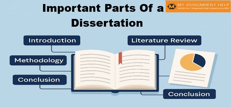 Important Part of Dissertation
Get Writing Help On Every Important Part Of Dissertation. Did you miss an important part of