Each student is required to prepare a design document, in the format of a report. A report generally consists of a number of pages with section headings and sub-headings. Page numbers are required on every page except the cover page. For ease of reading and marking it is suggested you also provide a Table of Contents with working links to the individual sections of the report.
Use the following table as a guide or checklist for the creation of your design document. Your report MUST have the structure as indicated in the first column of the table. Before handing in your assignment, make sure that all sections are present and that they contain the information required.
|
1. Topic Name & Description |
Write this as a summary of the entire website, NOT as an essay-type introduction to the assignment! |
|
1.1. Name |
As it will appear on your website’s homepage |
|
1.2. Description |
Detailed description and purpose of the site. |
|
2. Target Audience |
The type of people who will want to view your website |
|
2.1. Demographics |
Discuss targets Age, Gender, Education, and Interests. |
|
2.2. Justification |
Why the specified target audience and not others? |
|
3. Storyboards (Early sketches) |
|
|
3.1. Basic sketches |
Initial sketches of each significantly different page. Example: Home layout, Gallery layout, and one that shows the general layout of all other pages. If you design other layouts for specific pages include them also. |
|
4. Competitive Analysis |
Four (4) websites that are similar to the one you will be creating (eg. Personal Websites!) In your analysis you need to identify why you chose the websites you have analysed |
|
4.1. Analysis of good sites (2) |
Use the evaluation sheet from the lab session |
|
4.2. Analysis of bad sites (2) |
Use the evaluation sheet from the lab session |
|
4.3. Summary of good and bad points |
Short summary of elements you are considering using in your website and those to avoid. |
|
5. Content Requirements |
The Content Requirements section needs to read like an inventory of all items of information required to make the website functional; this is an “unformatted” section in that it requires you to note all elements needed BY NAME ONLY., The way the content is presented is to be detailed in Section 8 of the document |
5.1. Content Inventory |
Simple list of keywords identifying ALL CONTENT for each page. Example of the Education page: Text-University of Ballarat (2013), Image-University of Ballarat, Text-Federation University (2014), Image-Federation University, Image-Myself at University, Text-ITECH2106 Information, etc. |
5.2. Categories & Labels |
See the “WEBSITE OVERALL REQUIREMENTS” document and organise the pages into groups. Example the two gallery pages could fall under one ‘category’ – affecting the way you would plan your navigation to those pages (they are still 2 pages which you will ‘label’ under the one category). For further info on categories and labels, see Lecture 2. |
|
5.3. Functional Requirements |
You will need to detail where your forms will be located, how they function (such as JavaScript and HTML) and what will happen with the information (such as data validation and user feedback). This includes the required contact page with 4 elements and the password protected page functionality. |
|
6. Information Architecture |
|
|
6.1. Site map |
Graphical representation of the pages in the website, such as a hierarchical diagram; must have identifying labels and show relationship between the pages. Masters students (ITECH6106) should also indicate which page is password protected, and don’t forget the contact page in the sitemap! |
|
6.2. Wire frames |
Digitally-created wire frames for each significantly different page in the website (based on the Storyboard sketches) – lab 4 contains directions for these. |
|
7. Navigation scheme |
Identify how users will navigate the website, including the navigation from section to section, internal page to internal page, and internal page to external site. |
7.1. Global navigation |
Description of how users will navigate the entire site. Include details of any primary and secondary navigation. |
|
7.2. Local navigation |
Description of how users will navigate the pages within a category. Items you categorised together under one category (the two galleries for example), may need a drop-down menu or navigation within that category |
|
7.3. Footer |
Description of the navigation available in the footer. On such a small website, include the sitemap link. |
|
8. Content Design |
Full marks will only be given for the detailed description of each page within the site; |
|
8.1. Content Layout for each page |
Detailed, short description of the content for all pages in the website. NOTE: “description” not the actual content. |
|
8.1.1. Name of page 8.1.2. Layout of page
|
Self-explanatory Type of media, content and layout, size of display area. Example: “Type: Textbox. Content: this text contains information regarding my passion for my career, located under the navigation, spanning the width of the webpage. Size: 960px width x 200px height.” |
9. Visual design |
|
|
9.1. Description & justification of the chosen design |
Describe the visual design and explain why the chosen design is suitable for the website. |
|
9.2. Description of colour scheme/ fonts chosen |
Description and justification for the colour scheme chosen. Identification of the main colours used in hexadecimal notation. e.g. Background dark-grey #272727; text heading #6f71fd; body text #ffffff; identify and justify each different font face you will be using. |
|
9.3. Mock-ups of every |
This is a visualisation of the wire-frames with elements in their proper position but without any real content, other than visible navigation elements. Mock-ups should clearly show the navigation, the colour scheme chosen, as well as how content will be treated. |
|
10. Appendix |
Any other information for which there is no sub-heading |
|
10.1.Raw data collection |
References to the materials from which you will develop the website must be present, such as any text, images and media you will use on your website. Images can be inserted into this section or provide exact links to its location. Textual content you will use may contain links to related content; for example you may provide a link to your Federation University courses for the education page. Remember that these will need to be reworked for Assignment 2 according to the rules of “writing for the web”. HOWEVER do not rework the information now, keep them in their raw format! |
|
10.2.References |
URL of webpages and/or references for documents from which you will use any content to be placed on the website you are developing. |
1.1. Topic: PropertyGrounds
1.2. Description: In conjunction with its study to evaluate the achievability of building a Property Sales site, EPA met with potential purchasers and merchants of Propertygrounds, and other national and nearby stakeholders, to request their thoughts and recommendations about how to work such a site to best serve their needs. By and large, numerous property managers give off an impression of being ready to give data about their properties, yet fail to offer the assets needed to gather and amass extensive data and overhaul it routinely. Then again, prospective purchasers of Propertygrounds yearning however much data as could be expected to upgrade their capacity to screen properties and distinguish the properties that best meet the purchasers' criteria. On the premise of its talk with brownfields stakeholders, perceptions of data that is presently gathered about Propertygrounds, and data that is accessible to the overall population about postings of Propertygrounds, EPA is giving a recommended least set of data things that ought to be introduce for a property keeping in mind the end goal to incorporate that property in a site that rundowns Propertygrounds available to be purchased. Site administrators may need to strike a parity in characterizing least data things for their frameworks.
2. Target Audience
2.1 Demographics: the website is intended for age groups higher than regular teens (16+) as the website would be catering the services of property so the age group above 16 can buy, rent or sale according to their basic needs.
2.2 Justification: Any audience below 16 would not be eligible as they ant legally allowed to sell, rent or buy the property hence the age group would be 16+ only.
3. Story Boards
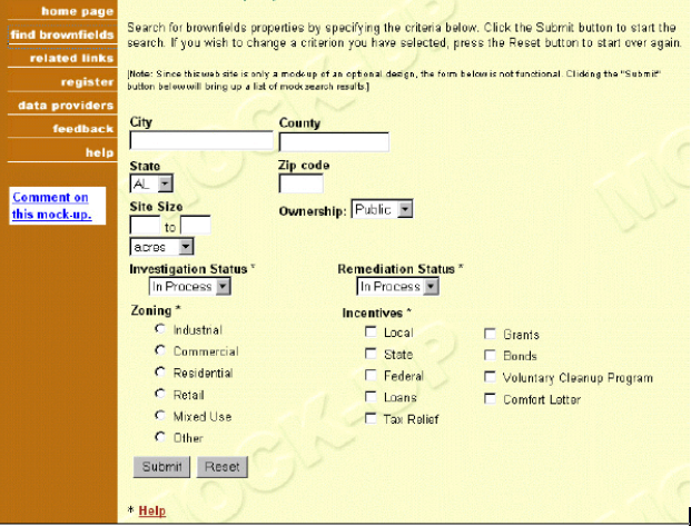
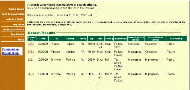
4. Competitive Analysis
4.1 Analysis of good Sites:
4.1.1 Zillow.com.com:
4.1.2 Realtor.com:
4.2 Analysis of bad sites
4.3 Summary
5. Content Requirements
5.1 Content Inventory:
5.1.1. Property Information Page: Property Image
Property Name
Property Address
Property Location Map
Property Owner Details
Property Status
5.1.1.1. Home Page: Property Images (Random)
Property Samples
Recent Sales
Search Bar with different selectable options
5.2. Categories and Labels:
5.2.1 Galleries
Target Audience
5.2.2 Property locations
5.2.3 Property Management
5.2.4 Content Management
(6). Information Architecture
6.1 Site Map
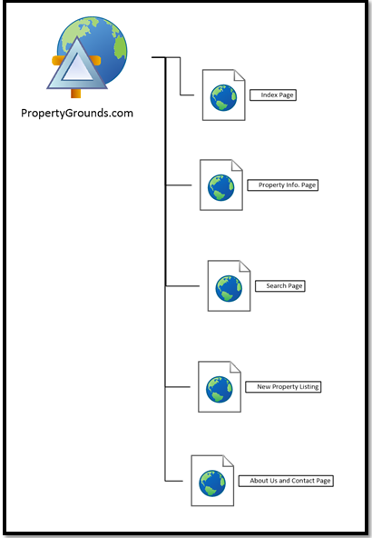
6.2 Wireframes
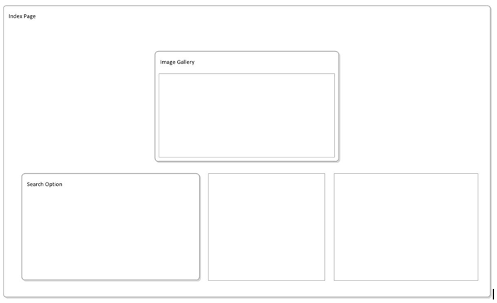
7. Navigation Scheme
7.1 Global Navigation
The essential capacity of a site ought to be to permit clients to effectively seek a database of Propertygrounds. The optional capacity of a site ought to be to permit clients to include or overhaul the records in the database. This is an imperative capacity for Propertygrounds on the grounds that; (1) the Brownfields Program keeps on growwing and new properties are always being added to the project, (2) properties need to be expelled from the information base in light of the fact that they are sold or for different reasons, (3) new data to portray defilement is being acquired as properties travel through the site evaluation procedure, and (4) property managers keep on receiing new motivators to redevelop their properties and data about these motivating forces ought to be conveyed to potential buyers.
7.2 Local Navigation
The Local navigation can be done using the breadcrumb and menu buttons provided so that the user can navigate to all the pages irrespective of the current location.
7.3. Footer
The footer would contain the regular menu Contact Us, and copyright information as the menu and navigation would be handled majorly by the global and local navigation
8. Content Design
8.1. Content layout
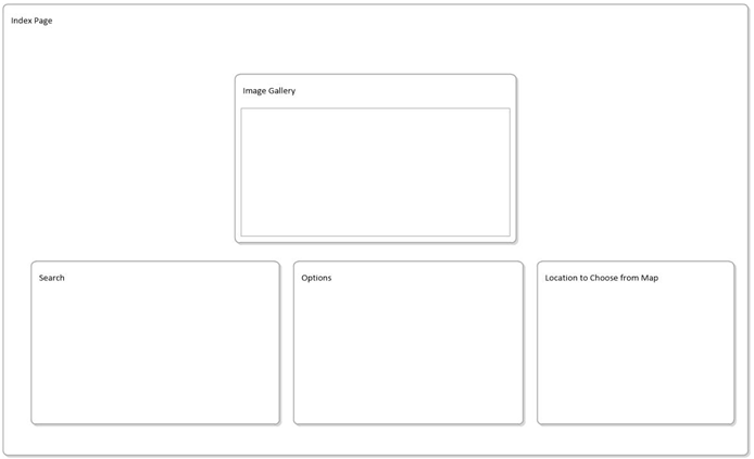
8.1.1. Name of page: Home/Index Page
8.1.2. Layout:
Type: Image Gallery.
Content: Contains images of the property
Size: 360px width x 200px height.
Type: Search Option
Content: Search Tab
Size: Left corner of the website 360px width x 200px height.
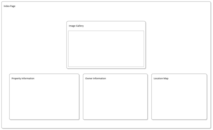
8.1.3. Name of page: Property Information
8.1.4. Layout:
Type: Image Gallery.
Content: Contains images of the property
Size: 360px width x 200px height.
Type: Property Information
Content: Property Tab
Size: Left corner of the website 360px width x 200px height.
Type: Location Map
Content: Property location on google map
Size: Left corner of the website 360px width x 200px height.
9. Visual Design
9.1 Description & justification of the chosen design
The outline of the property may incorporate an immediate connection to an alternate site or an alternate database that gives more point by point data. Connections to different wellsprings of data can be fulfilled through two programming techniques. The easiest strategy is to give a connection to the landing page of an information supplier. All things considered, it might be essential that the client run an alternate inquiry to discover the data portrayed. The second system is to connection straightforwardly into the database of the information supplier. The client would have prompt access to all accessible data; and no extra looking would be fundamental. The second technique has clear favorable circumstances for the client, yet it is significantly more confused from a programming viewpoint.
The system obliges an abnormal state of participation between the administrators of a site of Propertygrounds and information suppliers. As a rule, specialized snags may make the second technique unreasonable.
9.2. Description of colour scheme/ fonts chosen
Background: #FFFFFF
Reason: Better display and also great for viewing on mobile devices as well.
Font: #000000
Reason: Black and shows best on any devices
10. Appendix
10.1. Raw Data Collection
To add properties to the database, information suppliers could be given alternatives. The number and sorts ought to be needy upon the potential number of information suppliers, whether the database will be nearby state, provincial, or national, and the degree of value control of the information. Case in point, the accompanying choices may be fitting for a state or national database:
- use an online information entrance structure. The information supplier just rounds out the structure on the website page. The information are added to the database when the client clicks an "Upgrade" catch at the base of the screen.
- download a duplicate of the site's information structure in a MS Access position. A straightforward client manage (one or two pages) giving specialized rules for either a beginner client or a database pro could be arranged and made accessible for downloading alongside the MS Access database. After all information have been moved into the MS Access database, the information supplier sends the MS Access database once more to the administrator of the site by email or document exchange convention (FTP). The alternative permits the information supplier to finish the document when advantageous and to create their own duplicate of the data gave.
- Submit vast volumes of information in computerized arrangement, for example, MS Access or ASCII comma delimited. The information could then be foreign made into database for the site.
10.2.References
Chao, D. (2005). The Designing of Web Services to Deliver Web Documents Associated with Historical Links. International Conference On Next Generation Web Services Practices (Nwesp'05). doi:10.1109/nwesp.2005.73
Mohorovicic, S. (2013). Implementing responsive web design for enhanced web presence. Information &Amp; Communication Technology Electronics &Amp; Microelectronics (MIPRO), 2013 36Th International Convention On, 1206-1210. Retrieved from https://ieeexplore.ieee.org/xpl/login.jsp?tp=&arnumber=6596440&url=http%3A%2F%2Fieeexplore.ieee.org%2Fxpls%2Fabs_all.jsp%3Farnumber%3D6596440
Shih, T., Jianhua Ma, & Huang, R. (1999). The design and implementation of a distributed Web document database. Proceedings Of The 1999 ICPP Workshops On Collaboration And Mobile Computing (CMC'99). Group Communications (IWGC). Internet '99 (IWI'99). Industrial Applications On Network Computing (INDAP). Multimedia Network Systems (MMNS). Security (IWSEC). Parall. doi:10.1109/icppw.1999.800116
Yao, J., & Li, J. (2006). Practical Design and Implementation of Web-Based Document Management Systems. 2006 10Th IEEE International Enterprise Distributed Object Computing Conference Workshops (EDOCW'06). doi:10.1109/edocw.2006.57
To export a reference to this article please select a referencing stye below:
My Assignment Help. (2016). Essay: Guide To Creating A Design Document For A Website." (70 Characters). Retrieved from https://myassignmenthelp.com/free-samples/website-design-document-web-page-multimedia-design.
"Essay: Guide To Creating A Design Document For A Website." (70 Characters)." My Assignment Help, 2016, https://myassignmenthelp.com/free-samples/website-design-document-web-page-multimedia-design.
My Assignment Help (2016) Essay: Guide To Creating A Design Document For A Website." (70 Characters) [Online]. Available from: https://myassignmenthelp.com/free-samples/website-design-document-web-page-multimedia-design
[Accessed 20 May 2025].
My Assignment Help. 'Essay: Guide To Creating A Design Document For A Website." (70 Characters)' (My Assignment Help, 2016) <https://myassignmenthelp.com/free-samples/website-design-document-web-page-multimedia-design> accessed 20 May 2025.
My Assignment Help. Essay: Guide To Creating A Design Document For A Website." (70 Characters) [Internet]. My Assignment Help. 2016 [cited 20 May 2025]. Available from: https://myassignmenthelp.com/free-samples/website-design-document-web-page-multimedia-design.
